
Itefy Go, rebuilt: everything you did before, in your thumb's reach
The Itefy Go mobile app has been rebuilt from scratch. Same account, same data, same sign-in — but scanning is one tap from anywhere, the home screen tells you what needs attention, you can register equipment from your phone, and checking things in can put them back where they belong.
The short version
- Everything you did in the old app, you can still do. Same account, same data, same sign-in, same permissions.
- Scanning is now the round button in the middle of the bottom bar, on every screen.
- You can register equipment from your phone — photograph it, name it, save.
- Checking items in can put them back where they belong, in one tap.
- NFC tag reading and writing has been removed. QR codes are unaffected.
In this article
- The one thing to learn
- Where things moved
- The home screen actually tells you something now
- Scan, then do the thing
- You can register equipment from your phone now
- And you can correct one, too
- Checking in can put things back where they belong
- Kits know what's inside them
- Everything about one item, in one place
- Photos on faults and on jobs, while you're reporting them
- Locations finally look like your site
- Item types and contacts, without going back to the desk
- Sign in with Google
- Smaller things you'll notice
- The one thing that has gone: NFC
- What still lives in the web app
- If the app says you're not a member of any account
- Three things to try first
- Getting the new version
- Tell us what you think
If you use Itefy Go every day, this post is for you.
The app has been rebuilt from the ground up. Everything you did before, you can still do — same account, same data, same sign-in, same permissions. Nothing has been taken away except one thing, and it has a section of its own further down.
But things have moved, and if you're fast in the old app, every changed position costs you a second until you learn it. So here's the short version, up front.
The one thing to learn
Scanning is now the round button in the middle of the bottom bar.
It's there on every screen. You don't need to find an item first, or go home, or open a menu — point the camera at a label and Itefy Go opens the item.
If you remember one change from this post, remember that one. It's the change that saves the most taps, because scanning is what most people open the app to do.
Where things moved
| You used to… | Now |
|---|---|
| Tap Notifications in the bottom bar | Tap the bell in the top-right corner |
| Open Reservations, Checkouts, Issues and Events as four separate screens | All four live under the Activity tab |
| Open Manage locations from the dashboard | Home → Manage → Locations |
| Visit three separate change-log screens | Recent changes under Me — or the History tab on any item |
| Find sign out, switch account and theme under Me | The More menu, bottom right |
| Tap Update under Me | Nothing to do — the app updates itself |
Five slots along the bottom: Home, Items, Scan, Activity, More.
The home screen actually tells you something now
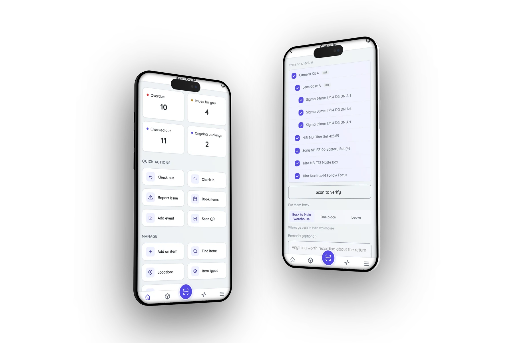
The old dashboard was a list of links to other screens. The new one leads with what needs you: how many items are overdue, how many are checked out, how many issues are assigned to you, how many bookings are running. Tap any of those and you land in that list, already filtered.
If nothing needs attention, it says so and gets out of the way.
Underneath are the actions people use most — Check out, Check in, Report issue, Book items, Add event, Scan QR — and below those, a Manage row for the things those actions draw on: Add an item, Find items, Locations, Item types and Contacts.
Then the items you looked at most recently, so getting back to something takes one tap.
Scan, then do the thing
Tap Check out on Home and the app asks how you want to pick the items:
- Scan one QR code — take a single item.
- Scan several QR codes — the camera stays on and every item you scan joins a list. Loading a van, this is the one you want.
- Select items — choose from a list, no labels needed.
That last option matters more than it sounds. The old app could only start from a QR code, so anything unlabelled, or labelled on a face you couldn't reach, meant going to the web app. Now every record — a checkout, a booking, an issue, an event — can be built either way.
Then the form opens on top of the scanner with the items already in it. Scan → done.
You can register equipment from your phone now
This is the big one for anyone who manages equipment rather than just uses it.
The old app could add items, but it was a form built for a desk. The new one is built for standing in front of the thing:
- Tap the photo tile and take a picture.
- Type a name.
- Save.
That's a complete item, in about ten seconds. Type, location, unique ID, purchase details and description are all there if you want them — tucked behind More details so they never slow down the fast case.
Afterwards, Itefy Go asks what's next: assign a QR label, add another (which keeps the type and location, because the next thing on the shelf is usually similar), or open the item.
And you can correct one, too
Registering equipment in the field is only half of it. Everything you'd normally go back to the desk to fix is now on the item's action menu:
- Edit item — name, unique ID, type, location, the purchase figures
- Specifications — serial numbers, ratings, whatever the plate says
- Categories — tag it so it turns up in the right filter
- Suppliers & service — link the dealer and the service company to the item
- Switch it between equipment and consumable
An item screen also now shows what the thing cost and what it's worth today, which is the number you want when you're deciding whether to repair it or replace it.
Checking in can put things back where they belong
When you check equipment in, the app asks where it's going:
- Back to its usual place — every item to its own home location, in one tap. If they all share one, it names it.
- One place — everything to the same location. This is the "empty the van into the workshop, sort it out tomorrow" button.
- Leave — don't move anything, which is exactly what the old app did.
There's a Scan to verify button on the same screen: scan the items as you unload them and they tick themselves off, so a case that comes back one lens short says so before you've walked away.
You need the Location permission for the first two options. Without it, checking in works normally and the app simply doesn't offer to move anything.
Kits know what's inside them
Pick a kit for a checkout or a booking and the app shows you what's coming with it, as one box, before the record is created. No more discovering at the job that the flight case brought four things and you needed five.
There's also Audit this kit on any kit's action menu. It opens the scanner with the kit's contents as a checklist, and nothing is written — scan your way through the case and the app tells you what's missing. It's the pre-flight check, separate from committing the kit to anyone.
Everything about one item, in one place
Open any item and you get:
- a single big button that says Check out, or Check in if it's already out — or Adjust stock if it's a consumable
- Move and Condition right beneath it
- tabs for Info, Photos, Files, QR and History
The item screen also tells you whether the thing is booked by someone for later, not just whether it's out right now.
History is new. Condition changes, location moves and stock adjustments used to live on three separate screens; now they're one list on the item, newest first, so you can see what's happened to a machine without hunting.
Photos gained something small but useful: you can now choose which picture is the main one. People tend to photograph the serial plate first and the equipment second, which left the wrong image representing the item everywhere.
Photos on faults and on jobs, while you're reporting them
Reporting a problem and logging a job can now carry pictures and files, attached while you fill in the form rather than afterwards from a desk. A photograph of the damage, taken at the moment you find it, is worth more than a paragraph describing it a day later.
Locations finally look like your site
Locations used to be a flat list of names. Now they show their structure — a shelf inside a storeroom inside a building — and each one has a kind: Site, Building, Room, Storage, Vehicle, Container.
That means Van 1 and Aisle A are finally distinguishable at a glance. And when you filter items by a building, you get everything inside it.
Better: you can create a location while standing in it. Add one from the phone and it offers your current position on a map — drag the pin to be exact — and fills in the address from it. That's the one thing the web app can't do, because the web app isn't there.
Item types and contacts, without going back to the desk
Item types had no home in the old app at all. You could accidentally create one from the add-item form and never correct it. Now there's a screen for them under Home → Manage → Item types, and you can add one on the spot while registering equipment.
Contacts are there too, on plans that include them — suppliers, service companies, the people you hire gear to.
Sign in with Google
Alongside your email and password, you can now Continue with Google if your Itefy user has the same address as your Google account. One tap, nothing to remember.
Forgot your password? That's handled in the app now too, instead of sending you off to the website.
Smaller things you'll notice
- Light and dark themes, under Appearance in the More menu — and reachable before you've even signed in. Dark for the van at night, light for bright sun.
- Pull down to refresh on Home, Items, Activity, Locations and the rest.
- Undo on the confirmations, for when you tap the wrong thing.
- The app updates itself. When a new version is ready a banner appears with a Reload button. No more hunting for an Update option.
- Send feedback in the More menu, which reaches us directly.
- Emoji work now, anywhere you can type.
The one thing that has gone: NFC
Reading and writing NFC tags has been removed. QR codes are unaffected, and the QR tab on an item still shows the code, assigns one and removes one.
This was decided by testing on real handsets rather than reading spec sheets. Web NFC works in Chrome on Android — and nowhere else that matters. Safari will never have it: WebKit's published position is that the specification is harmful, not merely unimplemented, and every browser on iPhone and iPad is WebKit underneath. Worse, Samsung Internet advertises the feature without implementing it, so the app's own check said "supported", the button appeared, and then nothing happened when a tag was presented. Samsung is the biggest Android brand across much of Europe.
Keeping a button that silently fails for a large share of the people who can see it is worse than not having the button. If NFC comes back it will be in a real native app, where it works everywhere or not at all.
What still lives in the web app
Itefy Go is for acting on equipment, not administering it. These stay on the desktop, where they belong:
- archiving, restoring and deleting items
- building and changing kits — the phone shows and audits them
- recurring reservations, and editing a series
- event expenses, reports and exports
- adding videos to an item
- users, permissions, plans and billing
- bulk edits and spreadsheet import
If the app says you're not a member of any account
The rebuilt app honours the Mobile App permission, which until now was a switch that did nothing. If someone on your team signs in and can't see your account, that's why — an owner or administrator can fix it in a minute under Settings → Users → Permissions → Mobile App in the web app.
Three things to try first
- Tap the round Scan button and scan anything.
- Check something in and choose Back to its usual place.
- Open an item and look at the History tab.
Getting the new version
If you have Itefy Go on your home screen, open it and it updates itself. On Android that happens the moment you open it.
On iPhone and iPad, if it still looks like the old app: close it completely — swipe up from the bottom and flick the Itefy Go card away — then open it again. Once. iOS keeps an installed web app suspended rather than closed, and a suspended app never notices that a new version has arrived.
Not installed yet? Open go.itefy.com in your phone's browser, sign in, and add it to your home screen — Share → Add to Home Screen on iPhone, or Install app from the Chrome menu on Android. Installing is what enables push notifications.
Full instructions are in the Itefy Go help section.
Tell us what you think
This rebuild came out of watching how people actually use Itefy on a site: one hand, often outdoors, usually in a hurry. If something is slower than it used to be, or you can't find something that used to be right there, we want to hear about it — there's a Send feedback row in the More menu, and it comes straight to us.