We have a new logo
The logo itself appears as only letters at first sight, but we have made some symbolics out of one of the letters.
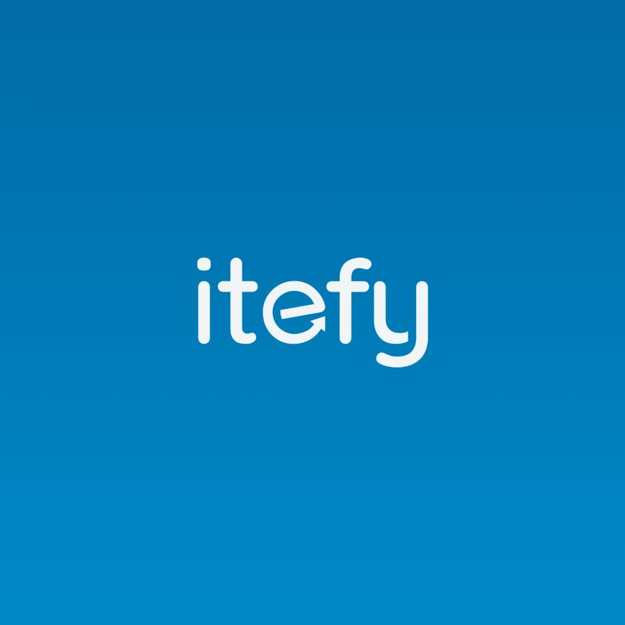
Our previous logo has been with us since 2014, and it was about time to revise it. With the new logo, we have considered what Itefy really stands for, and tried to implement that into it. The logo is assumably just letters with a fancy font, but we have made a little more out of one of the letters:
![]()
When one of the letters becomes the starting point for the icon of the logo, it's usually the first letter that is being used. But why should that be the rule? In our case, we found the e to be a much more interesting choice. This is why:
- It a circle, which with the arrow symbolize the lifecycle of the assets, equipment and inventory.
- The arrow is pointing upwards to the right, symbolizing better results.
- The letter itself is rotated 10° counter clockwise, also symbolizing something that's going upwards, like an airplane taking off.
We love to have a purpose with the logo, and think it will serve us good in the years to come, and remind us what Itefy is all about.
We hope you like our new logo as well!