Improvements and New Features to be released in August 2023
We are working on some fundamental improvements in the web app user interface that will make Itefy more efficient and easier to use. Here are the highlights of what's coming in the beginning of August 2023.
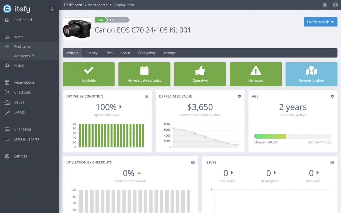
Menu from the top to the side
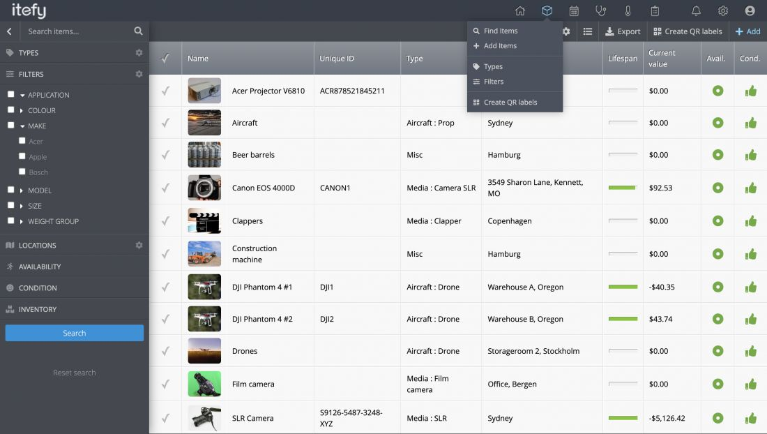
From when Itefy was first released in 2015, the main menu has been horizontally at the top of the screen. The reason behind the decision was to give the user as much horizontal space as possible, as it's natural to scroll up and down, but not sideways.

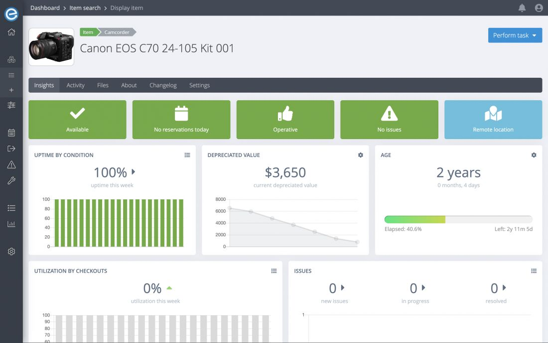
However, things have changed the recent years. First of all, most web apps out there is using a side menu, usually on the left side. And it's also common to make it collapsable on smaller screens. Also, the introduction of ultrawide display has paved the way for web apps to utilize horizontal space (if present) as well.


One of the main advantages of moving the main menu to the left side is that it gives plenty of space to expand with more menu points. As Itefy was growing through the years, we have tried to put every feature into just a few dropdowns, and only use icons (with a help text on hover). However, we have gotten feedback from a few of our users that it can be a bit confusing.
It's worth noting that there is still a top bar that contains a breadcrumb, buttons for personal options (signing out, switching accounts, etc.), and notifications.
Better ultrawide display utilization
We have simply dropped the width limit on most of the content in the web app so that if you're using a wide or ultrawide display, search result tables, item display pages, etc. will utilize the whole width of your screen.

Re-organized menu
The placement of the menu has also enabled us to re-organize and simplify the menu content itself. Instead of just a few very broad main menu points, we have divided the menu into four groups (in addition to a link to the dashboard):
- Resources, containing items, locations, and other filtering options
- Actions, like reservations, checkouts, issues, and events
- Analytics and historic data, like changelogs, reports (new), and statistics
- Settings
The menu is more self-explanatory than before and should be easy to adapt to.
Improved and standardized equipment search
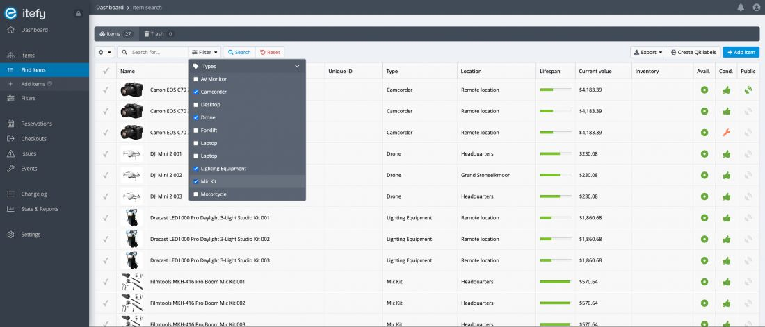
The item search and listing have been updated to our new, standardized search and filtering setup that has been used for a while in listings of reservations, checkouts, issues, etc. Up until now, the search options were located as a left slideout menu, however, it would now be in conflict with the new main menu.

Instead, you will now find all the search, filtering, and display options just above the search result. You will also find export, QR label, and add item buttons on the same line, but to the right. The result list also has gotten a few minor design changes.
Easy-to-understand naming
We have also done some clean-up in the naming department so that the service is easier to understand, especially for new users. Here are the changes that have been made:
- Filters to Categories.
- Search menu to Filters.
Reports
This is one of the new features that is still in beta. However, we have chosen to release it in order to gain some feedback from our users so that we will be able to add abilities that will actually make it useful for most users.
The reports feature will make it easy to generate reports and summaries for e.g. how much time certain items have been utilized (by checkouts) for each user.
What we are working on
We have some exciting new features and improvements in our backlog that we are currently working on, to be released in the next few months. Here are a few hints of what's coming:
- Dashboard Quick Status
- Item Dashboard
- Specs & Categories
- Upcoming reservations
- Recent Activity
- Description
- Item Kits
- Item Relations & Dependencies
Which feature or improvement comes first and last is uncertain, as we are working on multiple features simultaneously. However, once a feature is completed and tested, it will be released.
